
When The Richards Firm started working with us, their website was seemingly serviceable. It was true to their visual brand. It contained the basic information a potential client would need to know. It worked on mobile. Their website messaging was even optimized for search engines.
And yet, the site as a whole was falling short of its potential.
It was bringing in traffic, but that traffic wasn’t always converting. It was ranking well for some keywords, but it was struggling with others.
Why were these things happening? And more importantly, what could be done about them? It all starts with an in-depth website analysis (which we offer for free, btw).
Identifying the Gaps
After reviewing the website and a few competitors, we identified three primary shortcomings that needed to be prioritized.
- It didn’t focus on the ideal visitor.
- It didn’t stand apart from other law firm websites.
- It didn’t have clear pathways to follow.
Empathizing with the Target Audience
Being in an accident can be a very difficult, emotional, and/or traumatic experience. Even a simple car accident can be scary and overwhelming, especially if you’ve never been in one before. Most people coming to the Richards Firm had never been in a situation like the one they were currently in.
The previous version of the site failed to speak to the emotions and uncertainty that the target audience was experiencing. Instead, it tended to talk about The Richards Firm itself.
If we were going to reach these people, we needed to do a better job of connecting with their stories. They needed to become the primary focus.
Establishing Uniqueness
There are a lot of law firms out there, even if you’re just looking in the Greater Cincinnati area where The Richards Firm operates. The Richards Firm is certainly not the biggest. They don’t have the largest budget. They’re not the type of firm that’s going to have a giant billboard on the side of the highway.
If they were going to stand out, we needed to do a better job of showing their uniqueness on the website.
The Richards Firm was started to make the legal system more accessible, while always treating each client as a unique individual. Its founder, Rhys Richards, left his partnership at a larger firm so that he could achieve this goal. After all, personal injury is, well, personal.
The Richards Firm strives to always take a personalized approach to each individual that reaches out to them.
It’s not just about “getting your money fast”. It’s about being heard, understanding your options, and finding the best resolution possible. As Rhys Richards told us, “I can’t undo what’s happened to them, but I can help them find a way to move forward with their lives.”
That’s great. The problem was, their actual website looked and sounded like any other law firm website out there.
Having previously worked with Rhys when he was getting started, I knew that The Richards Firm was different.
Their current and past clients knew The Richards Firm was different.
But anyone visiting the website would likely see The Richards Firm as “just another law firm.”
Connecting with the visitor’s wants, needs, and pain points was great. But from there, we needed to establish what made The Richards Firm the best choice for them.
Establishing Clear Pathways
Websites often make the assumption that visitors will know what actions to take. This is a mistake. You need to guide them step by step. There should never be a point of uncertainty or a dead end. If a visitor is too unsure of how to proceed or they reach an endpoint, they’re most likely to leave altogether.
The only endpoint a website should have is after a visitor has taken a clear action step like filling out a contact form, making a call, signing up for a newsletter, or at least following you on social media. And even then, that’s not the end. If anything, it’s the true beginning of the journey.
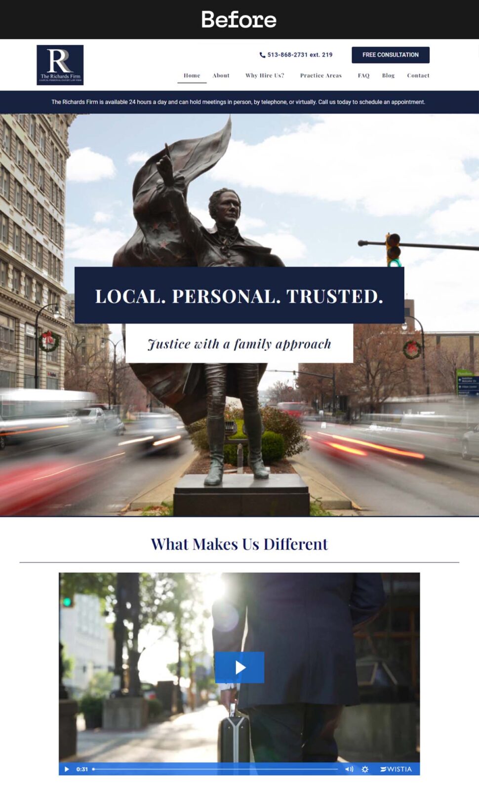
In the case of The Richards Firm, their previous site lacked these clear steps right out of the gates. The homepage had no primary call to action in its hero area (the large picture that fills the screen at the top). As you scrolled down the homepage, there was a continued lack of actions to take.
If you made it to any interior pages, they also didn’t lead anywhere.
Suffering from an injury is difficult, which is why it was all the more important that this website made their lives a little easier by providing clear pathways. This starts with establishing the primary action they should take. Once that’s set, we can build out additional actions and pathways to follow.
The end goal is always the same, but everyone needs to go on their own journey.
Building the Foundation
Before we started making changes across the website, we needed to set the tone. This is where content strategy and brand voice establishment are key. As with most of our clients, it starts with a content workshop.
During this workshop, we led The Richards Firm through a series of questions and discussion points based on the StoryBrand framework. This is a marketing method that places the primary emphasis on your ideal user and makes them the “hero” of your story.
From there, we can establish The Richards Firm as a more effective guide that accompanies them on their journey. It might sound like excessive or fluffy to those who aren’t familiar, but trust me when I say how transformative it can be.
We also use this workshop to establish general tone, key phrases, copy do’s and don’ts, and more.
With all of this information, our team crafts a single, cohesive Brand Voice document that acts as the foundation for all future content, both on the website and beyond.
Taking Action
The game plan has been laid out. The foundation is set. Now the fun begins. We didn’t need to completely rebuild or redesign the website. We just needed to renovate what was there. Think of it as Extreme Makeover: Website Addition. ]
A Better Homepage
We started with the homepage, as we usually do.
The homepage is one of the most important pages on any website. For most visitors, and therefore, it needs to connect with them, establish the site’s authority, and guide them along the path best suited for their needs.
This begins with the main hero area. This is what’s considered “above the fold,” meaning a user sees it without having to scroll further. This is one of the most critical areas, and it needs to accomplish quite a few things at once.
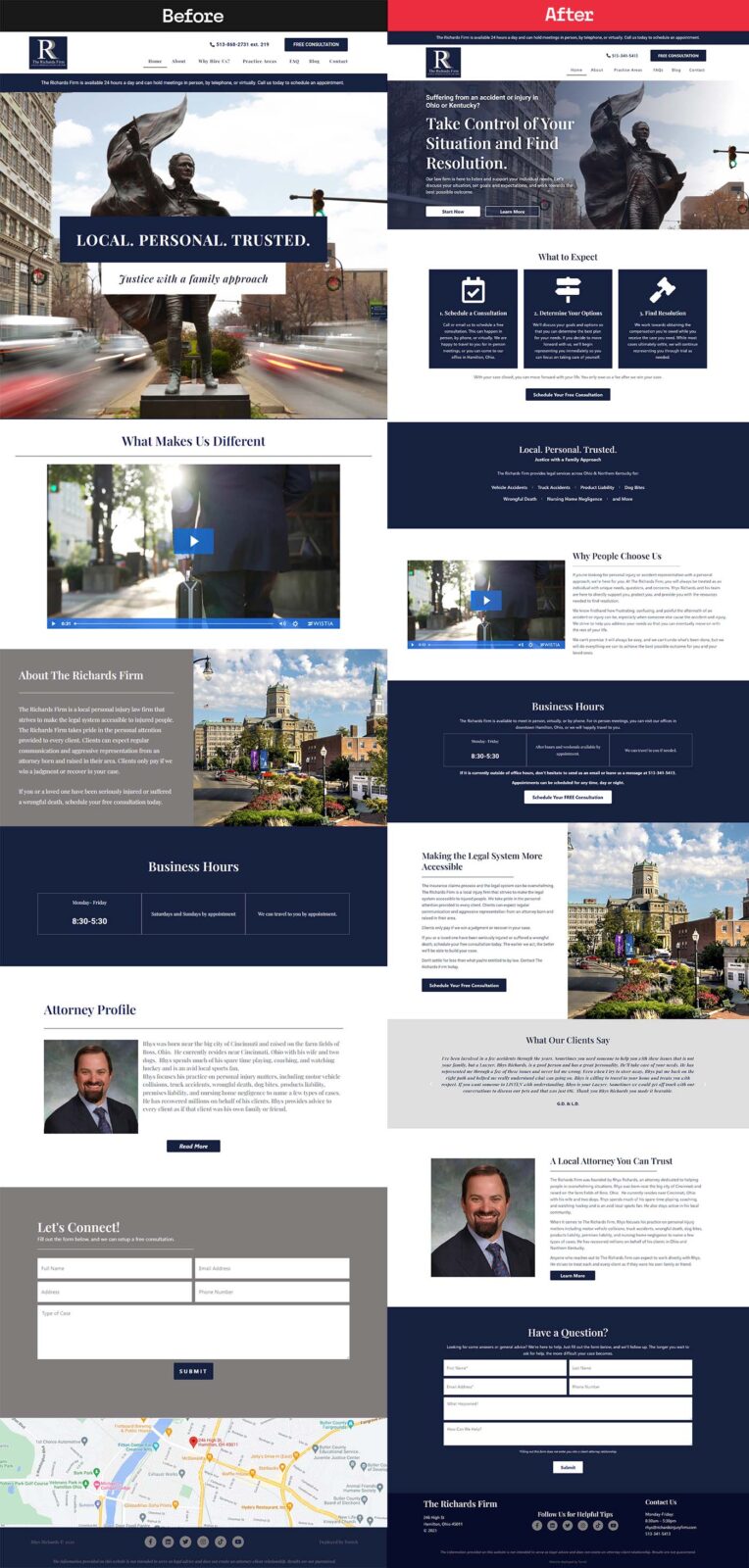
You can see there’s quite a difference between the before and after.
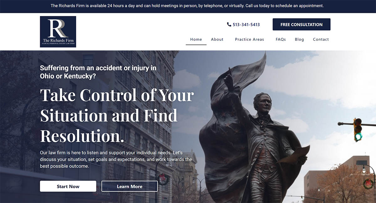
We start with a question that immediately identifies the need and location of the visitor. If this question doesn’t apply to them, then neither does this website. If it does, then they move down to a clear, powerful, and actionable statement. Accidents and injuries result in a loss of agency. This gives them the promise of taking back control.
The text below further establishes who The Richards Firm is and how they help people.
We then have two CTAs (calls to action). Some people may be ready to talk to an attorney as quickly as possible. Most likely, however, they’ll want to learn more about this firm, what they do, and why they’re different.
This secondary CTA leads them directly into a three-step breakdown of how it works.

As we said before, most people in need of a personal injury attorney are likely in this situation for the first time. There is a lot of uncertainty. This helps bring some much-needed clarity on how the process works. With this simple context, a few more people will likely be ready to take action, and so we have another consultation button ready.
Others, however, might still not be ready to trust The Richards Firm. And so, we have two sections devoted to establishing uniqueness and authority. On the previous version of the site, The Richards Firm had a video that established what made them different. While the video is good, not everyone wants to watch a view.
So, we included a block of text to accompany the video.
We call this the Hannah Montana strategy because you get “the best of both worlds.”
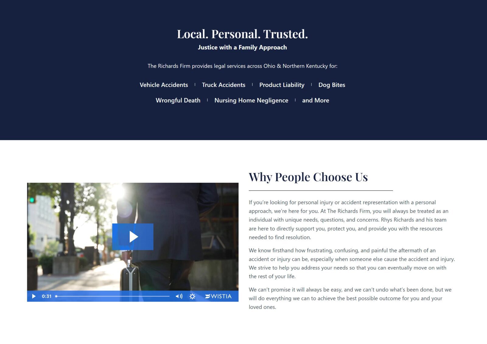
Moving down the page, we continue to provide key information such as business hours, general contact info, the mission of the firm, and the story of its founder. All of these continue to lead to other pages, always maintaining forward momentum.
Finally, we have a “catch-all” contact form at the bottom for visitors who are curious but a little uncertain. This provides a very low-effort action they can take immediately.
The Rest of the Site
With the homepage set, we took these same principles to the other interior pages. Each interior page acts as its own landing page with clear pathways to other areas. Because The Richards Firm had a great back catalog of blog posts, we were also able to incorporate those throughout the interior of the website.
There are numerous other UX updates, copy adjustments, and more that we won’t get into here.
The Results
By the end of the project, we technically hadn’t redesigned the website. It didn’t really say anything that the previous version hadn’t. There weren’t any new, fancy, highly technical features added.
And yet, the website looks and feels almost entirely different from its previous version.
But don’t just take our word for it. Here’s what Rhys Richards had to say about the project when it was done:
“I worked with Timothy before he founded This Blank Page. He was limited in what he could do to help clients reach the next level with their websites just like I was limited in my abilities at my old law firm before I started The Richards Firm. This Blank Page changed all of that. Through their personalized approach, we worked through various steps to improve our website. I am confident that our site is now the best version of itself and look forward to continuing to work with Timothy going forward.”
– Rhys Richards
A lot of websites don’t really need a redesign. Modern, clean, responsive websites are pretty common these days. But websites with good content strategy and user experience are far rarer than they should be. If you have a website that looks fine but doesn’t seem to be doing much for you, we suggest you reexamine your content strategy and UX.
Need some help? We’re here for you. Just visit our contact page here or submit a request for a free website assessment.